Belfast
PROJECT TYPE
Photography & Layout
PROJECT YEAR
2023
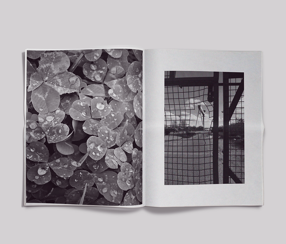
This project is a 50 page photographic exploration of Belfast, combining documentary style imagery with locally written verse to reflect the character and atmosphere of the city. Produced as part of the Belfast Photography Festival, the work was developed into a self initiated publication that I designed, printed and assembled independently.
Selected spreads from the book are shown below, demonstrating the relationship between image, text and layout. Red stamped marks are used throughout the publication as a visual motif, referencing Belfast’s maritime history through the use of Morse code.
The final publication was printed in tabloid format on 55gsm newsprint, a deliberate choice that reflects the raw quality of the subject matter. The lightweight material and large format support an accessible, editorial feel, allowing the work to be experienced as both a photographic record and a piece of printed ephemera.

The logo I have designed brings together sky, craft, and place through a simple yet symbolically rich form. Its dome-like silhouette and internal spiral echo the curvature and movement of the sky. At the same time, the mark hints at the shape of a fingerprint, reflecting the individuality and care of the brewer’s hand.

The logo is drawn freehand, giving it the warmth of something made rather than manufactured. This gesture strengthens the brand’s craft ethos while lending a modern graphic character. Yet it also feels timeless its spiral and dome shapes have the resonance of motifs found in ancient cultures and early markings from the landscape around Dedham. This lightly historical undertone connects Welkin to the deep human relationship with sky, land, and making.

The spiral element of the logo can be used as a submark. This is particularly useful for small or rounded spaces like bottle caps or beermats. The spiral can also be subtly referenced in other materials like the background of packaging for instance.