Making online grocery shopping faster
Understanding how Tesco users shop, where they experience friction and how the experience could be improved.
PROJECT TYPE
UX / User Research
METHODS
User Interview · User Journey Mapping · Empathy Mapping · Problem Definition · Wireframing · Prototyping

Overview
Shopping for groceries online should make the weekly shop quicker and easier. However, navigating large product ranges, finding specific items and dealing with unavailable products can introduce unnecessary friction.
To better understand the experience, I interviewed a current Tesco app user about their typical shopping habits, frustrations and expectations.
I used the findings from the interview to create a user journey map and empathy map, helping me identify behaviours, pain points and opportunities throughout the shopping experience.
The research ultimately led to a focused UX problem statement around making it easier and more efficient for users to find and purchase the products they need.
The Problem
The user shops for groceries online primarily to save time. However, complicated menus, difficulty finding products and dealing with out-of-stock items can make the ordering process slow and tedious.
The challenge was therefore to understand where friction occurs during the shopping journey and identify opportunities to make the experience more efficient.
How might we make it quicker and easier for busy users to find and purchase the groceries they regularly buy?
User Research
To better understand the experience of shopping with the Tesco app, I interviewed a current user about their typical shopping habits, frustrations and expectations.
The interview focused on how they normally complete their weekly shop, how they find products and which parts of the experience create the most friction.
This provided a first-hand perspective on the challenges users can face when searching for products and completing their weekly shop.
Interview Quotes
"I have a very busy job and schedule, my priority is to not waste my small amount of free time on menial tasks like grocery shopping."
"The first time I used the app it was confusing because of the huge amount of screens and menus."
"It's difficult to find the product I want because they are presented in long lists that are hard to sort"
"The auto recommended items aren't suitable"
Mapping the User Journey
I split the shopping journey into five key stages, from starting a shop through to completing the purchase. For each stage, I analysed the user’s actions, touchpoints, experience, pain points and opportunities.
This helped me look beyond individual frustrations and understand how each part of the journey affected the overall experience. Mapping these elements side by side made it easier to identify recurring issues and areas where the Tesco app could reduce friction and make shopping more efficient.

What the Journey Revealed
-
Time is critical.The user expects online shopping to save time, so unnecessary steps have a noticeable impact on their experience.
-
Navigation creates friction. Complicated menus make it harder for the user to quickly find the products they need.
-
Product availability disrupts the journey. Out-of-stock products create additional work when the user is trying to complete a familiar shop.
-
There is an opportunity to personalise the experience. The user's previous shopping behaviour could potentially be used to make future shops more efficient.
Empathy Map
I created a four-quadrant empathy map to organise the key insights from my user interview. I categorised the user's experience into what they do, think, say and feel, helping me build a clearer picture of their behaviour, motivations and frustrations.
This helped me move beyond individual comments from the interview and understand the user's experience from their perspective. It also highlighted key pain points and motivations that could be used to inform the next stage of the design process.

Research Findings
Four key themes emerged from the research:
-
Time is the priority. The user shops for groceries online to save time, so the ordering process becomes frustrating when it feels slow or tedious.
-
Navigation creates unnecessary effort. The user finds complicated menu systems confusing, making it harder to quickly find the products they need.
-
Previous behaviour could make shopping easier. The user's previous shopping baskets could provide useful data for recommending products that are relevant to their regular shopping habits.
-
Out-of-stock products disrupt repeat shopping. When copying across a previous shopping basket, unavailable products create an additional problem. Recommending similar products could help users complete their shop without having to search again.
The research suggests that the Tesco shopping experience could be made significantly more efficient by reducing the effort involved in finding products, using previous shopping behaviour more effectively and helping users deal with unavailable products.
From Findings to Opportunities
The research findings highlighted several opportunities to reduce friction and make the weekly shopping experience faster. I translated these findings into potential areas for improvement:
-
Simplify navigation. Streamline and simplify product menus to make it easier for users to find what they need.
-
Improve filtering. Allow users to filter products more quickly and accurately based on characteristics they regularly search for.
-
Personalise recommendations. Use data from previous shopping baskets to recommend similar and relevant products.
-
Provide smarter alternatives. When products from a previous basket are unavailable, recommend suitable alternatives so users can continue shopping without starting the search again.
-
Reduce the overall effort. Bring these improvements together to create a faster and more efficient shopping experience.
Defining the Problem
Turning research into a focused UX problem.
Using the insights gathered from my user interview, empathy map and journey map, I defined a clear problem statement using the Who, What, Where and Why method. This helped me identify who was experiencing the problem, what they were struggling with, where in the shopping journey it occurred and why it was important to address. Defining the problem in this way gave me a focused foundation for developing potential solutions.

UX Problem Statement
Busy working professionals need a quicker and easier way to find and purchase the groceries they regularly buy because navigating the Tesco website, finding products and dealing with out-of-stock items makes the shopping experience frustrating, time-consuming and overwhelming.
Concept Development
With the problem defined, I began exploring how the research findings could translate into practical improvements to the Tesco shopping experience. I focused on the opportunities identified during research: making products easier to find, reducing repetitive tasks and helping users deal with unavailable products.
Following the research, I sketched out a number of ideas to explore how the Tesco shopping experience could be made faster and more convenient. I focused on the main opportunities identified during the research: reducing the effort involved in finding products, making repeat purchases easier, helping users deal with unavailable items and introducing more personalised ways to discover products. I deliberately kept these ideas as quick, low-fidelity sketches so I could explore the concepts without becoming distracted by visual styling or detailed UI design.

Personalised home screen
The first sketch explores how the Tesco home screen could be adapted around the user's regular shopping habits. I introduced a "Buy Again" section that brings frequently purchased products directly onto the home screen, alongside the existing search and category navigation. I also explored a "Previous Basket" option, allowing the user to quickly return to a previous shop rather than rebuilding their basket from scratch.
Rationale
The research suggested that the user regularly purchases many of the same products and values the time-saving aspect of online shopping. By surfacing these products immediately, the user could add commonly purchased items without having to search or navigate through multiple categories.
Research finding → Users want to complete their weekly shop quickly.
Design response → Make frequently purchased products immediately accessible.

Improved product search
The second sketch explores the product search experience. I focused on making search a clear and efficient way of finding products, with filtering, sorting and frequent-buy indicators included alongside the results. The "Frequent Buy" label is intended to help users recognise products they regularly purchase, while the familiar product-list format allows them to compare options and add products directly to their basket.
Rationale
The research identified finding products as an area where the user experienced friction. Rather than relying on users to navigate through complex categories, I explored making search a more effective starting point, with filters and sorting helping users narrow down large numbers of results.
Research finding → Finding products can be time-consuming.
Design response → Make search, filtering and sorting more prominent and useful.

Previous basket with suggested replacements
The third sketch explores the Previous Basket feature in more detail. The concept allows users to revisit their previous shop and see how many of their previous products are still available. In this example, 16 of 18 products are available, while two are unavailable. Rather than simply telling the user that products are out of stock, I explored automatically providing suggested replacements. For example, an unavailable product could be paired with a similar alternative, allowing the user to make a replacement without having to search for another product themselves.
Rationale
This concept directly addresses one of the key frustrations identified during the research: unavailable products interrupt an otherwise familiar shopping journey. The aim is to preserve the convenience of repeating a previous shop while removing the additional effort created by out-of-stock products.
Research finding → Previous baskets make repeat shopping easier, but unavailable products create additional work.
Design response → Automatically suggest relevant alternatives when products are unavailable.

Trending recipes
The fourth sketch explores a different approach to product discovery through Trending Recipes.
Rather than expecting users to know exactly which products they want to buy, this concept provides recipe inspiration that can help users decide what to cook. I included cuisine filtering to make the content easier to browse and explored recipe cards with an option to add the required ingredients to the basket.
Rationale
This concept explores how Tesco could support users before they start searching for individual products. Recipe suggestions could turn meal planning and grocery shopping into a more connected experience, while allowing the ingredients for a chosen recipe to be added with minimal effort.
Research finding → Users want a simpler and more efficient way to plan their shopping.
Design response → Connect recipe discovery with product selection and basket building.
Refined Wireframes
Turning concepts into a clearer user experience
Following the initial sketches, I developed the strongest concepts into a set of refined wireframes. At this stage, I began to establish the layout, hierarchy and interactions of each screen while keeping the focus on the user's needs rather than final visual styling.
I developed four key areas of the experience: the personalised home screen, product search, previous basket and trending recipes. Together, these concepts explore different ways of reducing the time and effort involved in completing a weekly shop.
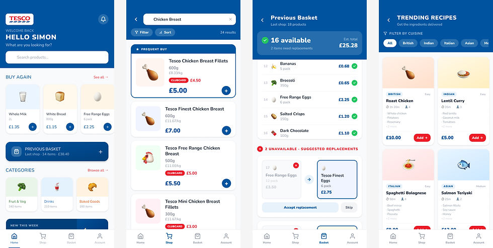
The refined wireframes allowed me to move beyond the initial ideas and establish how each concept could work within the Tesco shopping experience. I focused on reducing unnecessary steps, making frequently purchased products easier to access and providing support when users encountered unavailable products.
The four concepts also allowed me to explore both task-focused shopping, such as searching and repeating a previous basket, and discovery-led shopping, through personalised recommendations and recipes.
With the core layouts and interactions established, I moved into prototyping to explore how these concepts would work as an end-to-end shopping experience.
Prototype
With the refined wireframes established, I developed the screens into an interactive prototype to explore how the experience would behave during real use. The prototype introduced hover states, button feedback, active navigation states and other visual cues to make interactions clearer and give users confidence that their actions had been recognised.
These interaction patterns were guided by established UX heuristics, particularly visibility of system status, consistency and standards, and user control and feedback. For example, interactive elements change state when hovered over or selected, helping users understand which elements are clickable before they commit to an action. Buttons and navigation controls also provide immediate visual feedback after interaction, reducing uncertainty and making the interface feel more responsive.
I applied these principles across key actions such as adding products to the basket, navigating between sections, selecting filters and interacting with suggested replacements. Consistent behaviour across these components helps users build familiarity with the interface and reduces the amount of effort required to understand how each screen works.
Applying UX heuristics
Visibility of system status
The interface provides immediate feedback when users interact with controls, helping them understand that the system has registered their action.
Consistency and standards
Buttons, cards, navigation and interactive states behave consistently throughout the prototype, making the experience more predictable.
Recognition rather than recall
Frequently purchased products, previous baskets and suggested replacements are surfaced within the interface so users do not have to remember or repeatedly search for them.
User control and freedom
Users can choose whether to accept or skip suggested replacements, giving them control rather than automatically changing their basket.
Error prevention
Clear states and feedback help users understand what they are selecting or adding before progressing further through the shopping journey.

Usability Testing
The next stage of the project would be to validate the prototype with users through moderated, observed usability testing. Rather than asking users whether they liked the design, I would give them realistic shopping tasks and observe how easily they were able to complete them. This approach would help identify where users hesitate, misunderstand an interaction or take an unexpected route through the interface. Observing behaviour directly would provide more reliable insight than relying on opinions alone.
The testing would focus on whether users can:
-
quickly find and add a frequently purchased product
-
locate and reuse a previous basket
-
understand how suggested replacements work when an item is unavailable
-
search for a product and use filtering or sorting
-
discover a recipe and understand how to add the relevant ingredients
-
recognise interactive elements and understand the visual feedback provided by the prototype
The usability test would also allow me to validate some of the assumptions that came from the original user research.
For example, I would want to understand whether Buy Again genuinely makes repeat shopping faster, whether users trust the suggested replacements, and whether the Previous Basket feature is easy enough to discover without explanation.
This is important because the prototype represents a proposed solution to the research findings, but those design decisions would still need to be validated with users.
Conclusion & Reflection
This project gave me the opportunity to take a user-centred problem from research through to a proposed interactive solution. Starting with a user interview, I identified recurring frustrations around finding products, repeating regular purchases and dealing with unavailable items. I then used a user journey map and empathy map to organise these findings and define a focused UX problem. From there, I translated the research into design opportunities and explored a range of concepts through sketches and refined wireframes. Features such as Buy Again, Previous Basket, suggested replacements and recipe discovery were designed to reduce effort and make the shopping experience feel faster and more personalised. Developing the prototype also helped me think beyond static layouts. Adding hover states, active states and visual feedback reinforced the importance of clear system status, consistency and user control, and showed how small interaction details can make an interface feel more intuitive and trustworthy.
Reflection
One of the key things I learned from this project was the importance of connecting every design decision back to a genuine user need. Rather than redesigning the entire shopping experience, I focused on the areas where the research showed the greatest opportunity for improvement. The process also reinforced the value of moving gradually from research to insight, insight to concept, and concept to prototype. Each stage helped narrow the problem and gave the next stage a clearer purpose.
If I were to continue the project, the next step would be to carry out observed usability testing with regular online grocery shoppers. This would allow me to test whether the proposed features are genuinely easy to discover and use, identify where users hesitate or make mistakes, and refine the prototype based on real behaviour rather than assumptions. Overall, the project strengthened my understanding of how research, interaction design and usability testing work together to create a more effective user experience.