The logo I have designed brings together sky, craft, and place through a simple yet symbolically rich form. Its dome-like silhouette and internal spiral echo the curvature and movement of the sky. At the same time, the mark hints at the shape of a fingerprint, reflecting the individuality and care of the brewer’s hand.

The logo is drawn freehand, giving it the warmth of something made rather than manufactured. This gesture strengthens the brand’s craft ethos while lending a modern graphic character. Yet it also feels timeless its spiral and dome shapes have the resonance of motifs found in ancient cultures and early markings from the landscape around Dedham. This lightly historical undertone connects Welkin to the deep human relationship with sky, land, and making.

The spiral element of the logo can be used as a submark. This is particularly useful for small or rounded spaces like bottle caps or beermats. The spiral can also be subtly referenced in other materials like the background of packaging for instance.


Sea Emporium
PROJECT TYPE
Printed Catalogue
PROJECT YEAR
2025
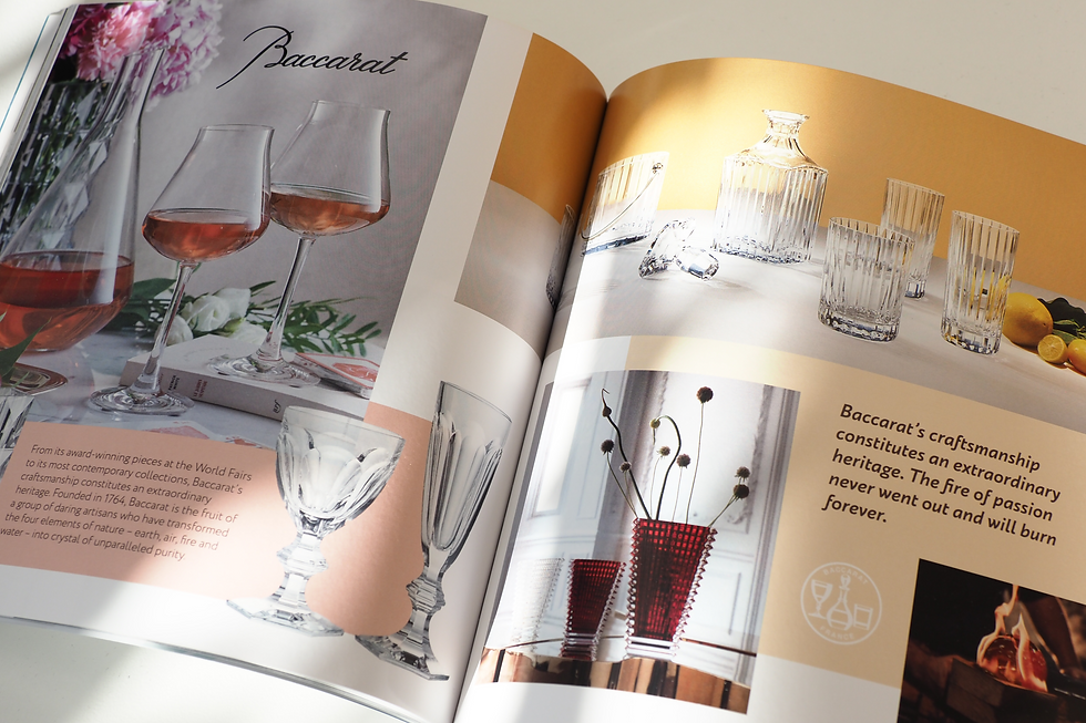
Sea Emporium sells luxury interior goods exclusively to the superyacht industry. This project involved the creation of a 100 page brochure showcasing many ultra luxury brands such as Baccarat, Christofle, Giobagnara and Haviland. Printed on 120 GSM satin with a 300 GSM soft touch embossed cover.